Decor & Renovation
Take a look at Benjamin Moore’s 2024 Colour Trends

Decor & Renovation
Take a look at Benjamin Moore’s 2024 Colour Trends
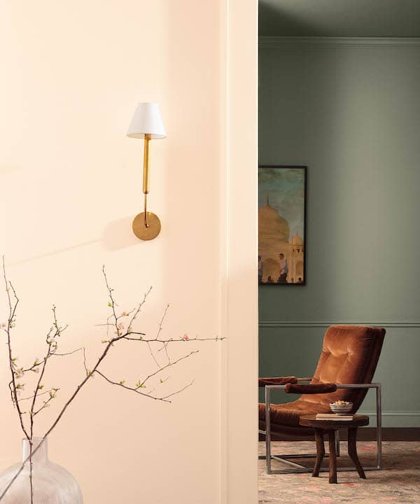
Benjamin Moore’s Colour Trends palette for 2024 is a juxtaposition of light and dark, warm and cool, contrasting and complementary tones.
“These contrasts invite us to break away from the ordinary to explore new places and collect colour memories that shape the hues used in our homes,” says Andrea Magno, Colour Marketing and Development Director at Benjamin Moore.
Pick and choose from any of these beautiful hues to spark creativity and bring individuality to your home, designed to look great on their own or paired together.
The 2024 colour of the year
Blue Nova CC-860

Photography, courtesy of Benjamin Moore.
Blue Nova is the colour of the year for a reason: it’s a blend of violet and blue, inspired by a new star forming in the sky and inspires a quest for adventure. This intriguing yet reassuring and elevated colour works as a main colour palette, on an accent wall, or even on pieces of furniture throughout the house.
Favourite spaces:
- Soothe your senses by making Blue Nova the primary colour in your bedroom.
- Update your living room by using Blue Nova for your walls and contrasting with Topaz.
- Integrate elements like ceramic vases and tableware into your kitchen.
White Dove OC-17

Photography, courtesy of Benjamin Moore.
White Dove is a clean and classic off-white that will elevate any room. The subtle warmth of this crisp hue is a great addition to any interior. It is versatile and luxurious all at the same time.
Favourite spaces:
- Brighten up your kitchen by painting the walls in this soft off-white.
- Create a welcoming atmosphere in your entrance with White Dove.
- Give your old furniture new life with this soft colour.
Pristine OC-75

Photography, courtesy of Benjamin Moore.
Sophisticated and versatile, Pristine is another shade of off-white you can integrate into your home. Veering into a more romantic hue, it has dusty rose undertones and gives off a delicate energy.
Favourite spaces:
- Pristine works great for a bedroom with its calming and soothing undertones.
- Add it to your bathroom for extra warmth and light reflection for when you’re getting ready.
- Create a soft living room by contrasting this sophisticated shade of off-white with deep greens and blues.
Regent Green 2136-20

Photography, courtesy of Benjamin Moore.
Regent Green is a deep pine green that almost looks black. Regal and sophisticated, it gives royal vibes with its deep green hue.
Favourite spaces:
- We’re loving this deep shade as the main colour of a living room to create a luxurious yet cozy vibe.
- Add contrast to a neutral room by painting your window panes in this deep green.
- Use Regent Green for an accent wall in your bedroom to add an element of sophistication.
Topaz 070

Photography, courtesy of Benjamin Moore.
Topaz is a “deep, radiant orange with rich undertones of brown and red.” Reminiscent of the south and summer days, it brightens rooms when used on walls or as accents throughout the house.
Favourite places:
- Channel warm dessert vibes in your living room with Topaz. Your home will look like summer even during the coldest days.
- Topaz looks great on curtains or other textiles, both in the bedroom or in any communal space.
Explore the 2024’s colour palettes others shades:


Comments