Decor & Renovation
An old cabin gets a refreshing update but keeps its charm

Photography by Barry Calhoun
Decor & Renovation
An old cabin gets a refreshing update but keeps its charm
A large new Alberta cabin maintains the heart of the tiny lakeside retreat that came before it.
Four years ago, a 1940s family cabin—quaint, homey and oh-so small—looked over the water in this spot on Alberta's Sylvan Lake, about two hours south of Edmonton. Now, thanks to its talented owners, Holly Baker (house flipper of inthefunlane.com renown) and her mom, Kathy Hanson, there's a new build with an updated cottage feel sitting on the property instead. The original 700-square-foot cabin, which once belonged to Baker's great-grandparents, had become tight quarters for Kathy, her husband and two grown daughters (plus, Baker's husband, daughter and dogs), so she asked Baker to help with the rebuild and design, which cleverly morphed the space into 2,250 square feet on two floors, and a finished basement. Though Baker and her mom differed in their previous style preferences (Kathy leans toward more traditional, ornate design, while Baker prefers light, open spaces with clean lines), the two were in complete agreement on two things: The cabin had to feel like a cabin, and it had to be friendly and inviting for guests. The pair found happy common ground with an eclectic mix of old and new that kept the spirit of the building but offered convenience and comfort as well. Here's how they did it.

Photography by Barry Calhoun
SKIP WINDOW COVERINGS

Photography by Bobby Calhoun
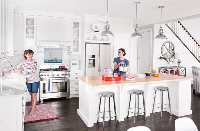
Baker and her mom have no plans to put window coverings in the kitchen or living room—which has a full wall of windows—because they want their view of the lake to be unobscured. "We want to see the water and greenery," says Baker, "to feel like we're both indoors and outdoors and let in as much light as possible."
SAVE ITEMS THAT TELL A STORY

Photography by Barry Calhoun
The original cabin contained furniture and knickknacks from various family members' houses over the years. "It had turned into a huge mishmash," says Baker. A lot of items were purged, but meaningful collectibles—including a beloved caricature sketch of Baker's great-grandparents done at The Lawrence Welk Show—are still displayed, and stones and a beam from the original cabin's structure were incorporated into the remodelled fireplace. "The new space is a nod to all the best things about the old," says Kathy.
LET FUNCTION GUIDE DESIGN SELECTION

Photography by Barry Calhoun
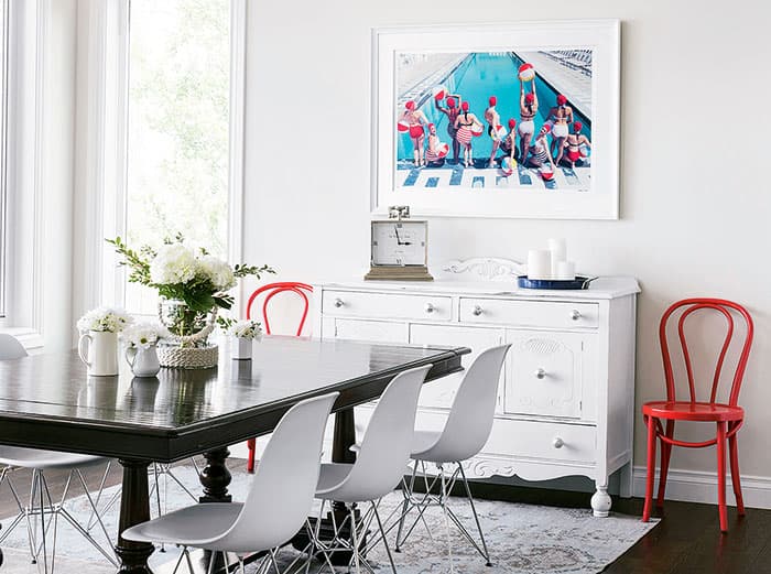
The first pieces of furniture that Baker picked for the dining room were the chairs. She knew that family and friends would come straight from the lake to the lunch table, even in wet bathing suits, so she wanted seating that was easy to wipe down and wouldn't become warped or damaged. "Then, we found a heavy traditional table [as well as a sideboard and accent chairs] at a thrift shop. The size, dark colour and price were a perfect fit."
MAKE TIMELESS CHOICES

Photography by Barry Calhoun
"Our family's first cabin lived to be almost 80," says Baker. "We're hoping this one will last even longer." To ensure that the space has staying power, Baker and her mom chose classic surfaces, such as white subway tile for the kitchen backsplash, beadboard for the cabinet interiors and back of the island, and grainy hardwood, which doesn't show wear and tear, for the floors.
BE INSPIRED BY HEIRLOOMS

Photography by Barry Calhoun
The red accents that help tie this space together are a nod to the crimson shade in an heirloom tea set that belonged to Kathy's husband's grandmother—one of the cabin's original owners. The tea set, on display in the kitchen above the refrigerator, is modelled after Little Red Riding Hood. "Her hood is the prettiest colour, so I decided to use it as the jumping-off point for cushions, trays, carpets and occasional chairs that all pop against the pale walls," says Kathy.
KEEP IT LIGHT

Photography by Barry Calhoun
The family wants to enjoy their time at the lake, not spend it cleaning, so Baker chose to keep the rooms free of unnecessary furniture and accessories. "Less surfaces mean less cleaning," she says. "We wanted the home to feel comfortable but also open and airy."
CHOOSE A WARM WHITE

Photography by Barry Calhoun
Though Baker likes bright white trim, she often sticks to off-white and grey-based hues for the walls in rooms she designs so they don't feel sterile. "Your eye usually assumes the walls are white, yet they still read as warm and inviting," she says.
EMBRACE MODERN ELEMENTS

Photography by Barry Calhoun
In the living room, Baker opted for a contemporary coffee table to offset the traditional furniture. She couldn't decide on a type of wood, and white seemed too crisp and clean, so when she found this streamlined Lucite version, she knew it was the perfect solution. "I love it because it doesn't block sight lines or close off the space."


Comments