Decor & Renovation
A 1950s home with comfort-guided design

Image: Robin Stubbert | Styling: Morgan Lindsay
Decor & Renovation
A 1950s home with comfort-guided design
Want a simple way to decorate? Let comfort be your guide.
Call it decor-phobia: the paralysis that takes hold in the face of a decorating project. Which of the 159 paint chips should you choose? And will you ever find that perfect side table?
"Clients go through this all the time," says Lynn Juhl, a Burlington, Ont.–based decorator. "And here's what I tell them: 'To avoid fear, seek pleasure.' " If curling up with a morning coffee sounds like heaven to you, place a comfy chair by a window. If board games with the grandkids are what you love, find a rough-and-tumble dining table. "Forget the detailed floor plan. Just focus on comfort and ease."
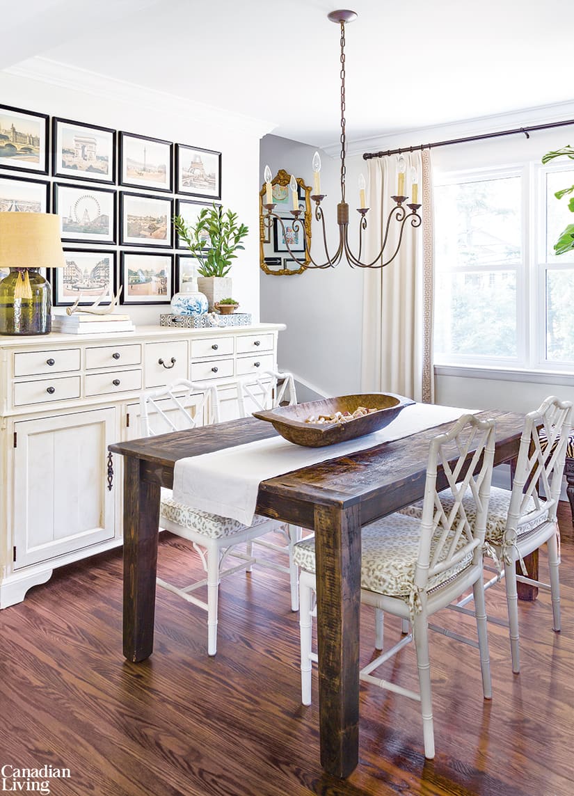
That's what Juhl and her husband, Mike, did when they downsized to a 1,400-square-foot 1950s build five years ago. The move cut their living space in half, so they had loads of stuff. Rather than getting rid of it, though, Juhl took it with her. "Then, I went shopping—through my own things!" she laughs. For instance, wanting a place to stash essentials in the dining room, she "shopped" her collection and found a roomy sideboard. A fresh coat of paint and—voilà!—storage is served.
For small spaces, Juhl recommends easy-care furnishings. "With no family room, a living room sofa has to be a workhorse," she says. "Cat hair, spilled wine, pen marks—it all happens there." And the coffee table is durable enough to accommodate the couple's regular pizza nights. "We don't even use coasters."
Bartering is a way to keep decorating costs low. "For example, I had a client who wanted a new backsplash, and she had dining room chairs I really liked. So my husband tiled her kitchen, and she gave me the chairs."
Another tip? "Don't take wall art too seriously," says Juhl. "Calendar pages or greeting cards look great in frames—plus, they're way more personal. I'm all for that. Who wants to live in a furniture showroom?"

Image: Robin Stubbert | Styling: Morgan Lindsay
Mix, Don't Match
In the dining room, a simple Mennonite-built table is offset by ornate chinoiserie chairs, while framed calendar pages enhance the wall above the painted sideboard.

Image: Robin Stubbert | Styling: Morgan Lindsay
Small Changes
Painting the old cream-coloured cabinets white and replacing one upper with open shelves brightened the kitchen. A vintage rug and pretty roman blinds add warmth.

Image: Robin Stubbert | Styling: Morgan Lindsay
Sill Style
"I love geraniums; they call for a windowsill," says homeowner and decorator Lynn Juhl. The French rural address sign has special meaning: 13 was her father's lacrosse-jersey number.

Image: Robin Stubbert | Styling: Morgan Lindsay
Fireplace Upgrade
Juhl's husband, Mike, built the fireplace mantel; the top (an old beam) holds an ever-changing display of books, art and flowers. The wall art includes travel mementoes and original paintings, while a faux zebra-hide rug brings in a timeless graphic touch.

Image: Robin Stubbert | Styling: Morgan Lindsay
Fresh-Air Eats
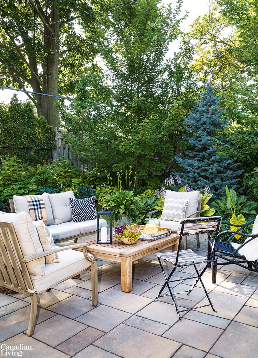
A teak conversation set, found on sale, and casual mismatched chairs (one a vintage rattan French-bistro piece, the other a metal big-box buy) help make the once-neglected backyard a veritable oasis. A throw is at the ready in case it gets chilly.

Image: Robin Stubbert | Styling: Morgan Lindsay
Effortless Entertainer
"Keep entertaining easy: just wine, salad and something on the barbecue," says Juhl (pictured). In the daytime, a pitcher of freshly squeezed lemonade pleases guests of every age.

Image: Robin Stubbert | Styling: Morgan Lindsay
Life Happens Here
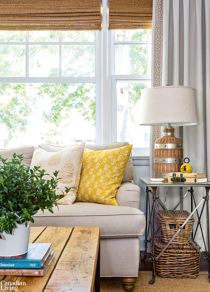
The curtains and furnishings in the living room are neutral. Juhl periodically swaps out the toss cushions and table lamps to keep things interesting. For cachet, she recommends animal-print fabrics: "They complement everything and never go out of style."


Comments