Decor & Renovation
9 stunning kitchen designs that will inspire you

Photography by Bruno Petrozza, Design by Emilie Ceretti
Decor & Renovation
9 stunning kitchen designs that will inspire you
You don't need to gut the entire space—or your bank account—to give your kitchen a fresh new look. The smallest of changes (think hardware, paint and backsplash) can make a huge impact. These stunning spaces show you how.
1. Paint them pretty

Photography by Yves Lefebvre
Easy upgrade: Painting your cabinets is one o the easiest ways to update your kitchen. We love the crisp white and the rich navy of this traditional kitchen—a fresh twist on ever-popular black and white—but if you want a lighter look, pair grey lower cabinets with white uppers. It can cost a lot to have your cabinets professionally sprayed, but luckily this is a great DIY project. Just be sure to choose a durable paint that's designed for cabinetry, use a foam roller and a good-quality brush and follow the manufacturer's instructions for drying times. The ultimate secret to successfully painted cabinets? Thoroughly clean and sand all surfaces and apply a coat of primer before painting.
Why we love it: The colour options are endless: Go bold, go neutral or paint your upper and lower cabinets in coordinating hues.
2. Light it up

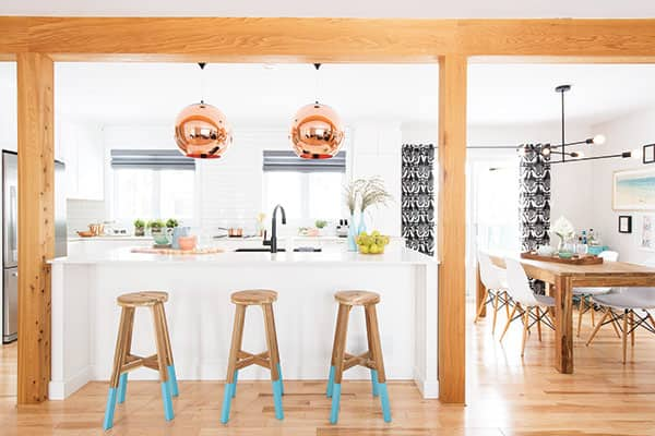
Photography by Bruno Petrozza. Design by Emilie Cerreti
Easy upgrade: Swap out old fixtures in favour of dramatic pendants, like these statement-making globes in a warm metallic finish. Great lighting is both practical and pretty, adding a jewellery-like finishing touch to an often utilitarian space. Standout options exist for just about every style, whether your kitchen is traditional, modern, glam or rustic—but don't be afraid to choose lighting that contrasts with your existing look. These sculptural pendants provide a glam counterpoint to the room's clean lines and neutral palette, making the overall look more special. A couple of rules to keep in mind: Hang pendants 30 to 36 inches above the countertop so they don't obstruct your view, and don't be afraid to play with scale. On its own, a fixture might be too small for a space, but in a pair or grouping, it has more visual impact. Also consider installing dimmer switches, which will allow you to adjust the light to suit a mood or an occasion.
Why we love it: Grouping two or three pendants over your island is a budget-friendly way to freshen up the look of your kitchen without having to completely overhaul the space. (And who doesn't need extra task lighting for meal prep?)
3. On display

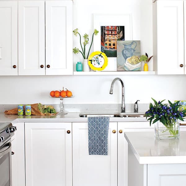
Photography by Janis Nicolay. Design by Riesco & Lapres Interior Design Inc.
Easy upgrade: Add open shelving. Ditching traditional uppers gives your kitchen a sense of space, but you can get a similar effect on a smaller scale—without having to stash your cereal boxes and everyday dishes in plain sight. Instead, create a designated space for display, as in this condo kitchen by the design team from Vancouver's Riesco & Lapres Interior Design Inc. In a little nook above the sink, art adds personality, while brightly coloured ceramics lend a cheery touch. If an open shelf feels too exposed, replace some cabinet doors with frosted-glass fronts. It's an inexpensive move that still allows you to achieve an airy quality.
Why we love it: Open shelving breaks up a wall of cabinetry and makes a clever alternative to a window, which most condo kitchens lack. Instead of a view of the outdoors, styled shelves provide the visual interest.
4. Pattern play

Photography by Ashley Capp. Design by Trish Johnston
Easy upgrade: Give your kitchen instant personality with bold wallpaper. This swirling green motif adds colour and interest without overpowering the room's clean lines and bright white colour scheme. When selecting a style for your kitchen, there are no rules: Go ahead and experiment with scale and colour. If you're worried about food splashes wreaking havoc on your walls, cover the wallpapered area with Plexiglas, available at specialty stores, like Toronto's Plastic World, where you can even have it cut to size. (But if you're covering an area of the wall that's exposed to heat, opt for glass instead.) The Plexiglas can be secured with an adhesive purchased from your local home-improvement store.
Why we love it: It gives your space a customized look—especially if you splurge on really great wallpaper—and, as long as you do your own installation, it's easy on the wallet.
5. Work it

Photography by Brandon Barre. Design by Jane Lockhart
Easy upgrade: Adding a simple workstation is a great way to increase you kitchen's functionality. "It's a place to manage the household and to keep things organized," says designer Jane Lockhart. "It doesn't have to be large—this one is only three feet wide." Base cabinets installed at table height, a durable work surface and a stylish desk chair are all you need to create your own kitchen command centre. If a built-in option is out of reach, repurpose a desk from another room in the house by painting it to match the cabinets and pairing it with one of your existing kitchen chairs.
Why we love it: You don't have to renovate to fit a desk into your existing floor plan.
6. Bring on the bling

Photography by Stacey Brandford. Design by Stacy Begg
Easy upgrade: Designer and former Style at Home design editor Stacy Begg recently refreshed her kitchen to make it larger, brighter and more family-friendly. To add sophistication to the space without spending a lot of money, she dressed up Ikea cabinets with chic golden pulls. "When it comes to kitchen hardware, always think of the overall look you're going for," says Begg. "I was working with warm metals—brass and gold gilt—but I didn't want it to look too traditional. I chose slim gold-tone pulls to keep things modern."
Why we love it: The pulls can easily be swapped out for new ones when you are ready for a different look.
7. Floors to adore

Photography by Wing Ta/Domino. Design by Kate Arends
Easy upgrade: Install statement-making patterned floor tiles. That's what homeowners Kate Arends and Joe Peters did in their Minnesota kitchen. Originally, the couple's floor was hardwood, but these graphic tiles, priced at $9 each, gave new life to the space and didn't cost a fortune. In an open-plan home, they also help delineate zones and, thanks to the hard-wearing nature of tile, spills and stains are a nonissue.
Why we love it: Beautifully patterned tiles are totally on-trend!
8. Fantasy island

Photography by Donna Griffith. Design by Greta Podleski
Easy upgrade: Bestselling cookbook author and former TV host Greta Podleski designed her kitchen island to look like a vintage sideboard. "I love the stylish view into the kitchen from the dining room," says Podleski. "And it provides a ton of functional storage." If a custom island isn't in the budget, create one from a vintage dining table or dresser. Just add a durable top, like marble or butcher block, and install castors to raise the top to counter height.
Why we love it: A sideboard-style option pairs the functionality of a storage-heavy kitchen island with the chic look of furniture.
9. Make a splash

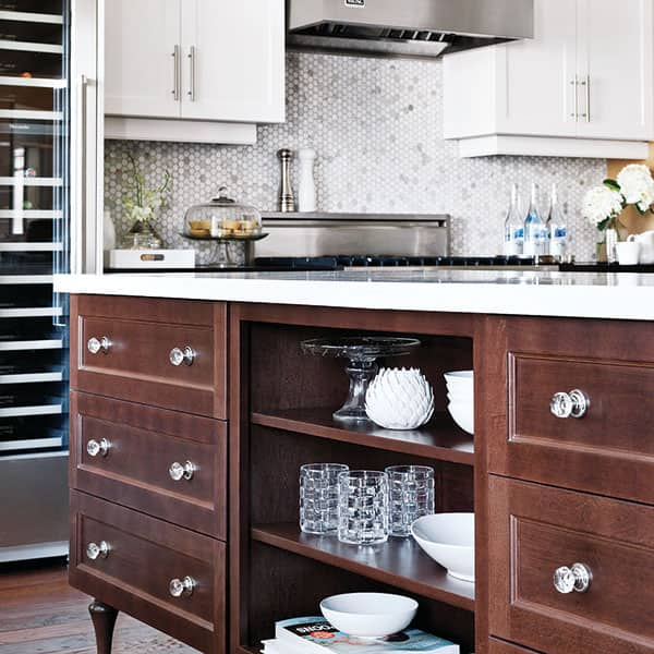
Photography by Stacey Brandford. Design by Janine Love
Easy upgrade: This kitchen, designed for Jillian Harris, features a gorgeous mosaic backsplash made of honeycomb- shaped marble tiles. Spanning the entire height of one wall, it adds a subtle pattern to the space. Combined with a neutral colour palette and industrial accents, like the range hood, the space has a cool, modern bistro vibe. A word of warning: Choose the shape, the finish and the colour of tiles carefully. You'll want to live with your backsplash for years to come, so don't select a style that's too bold or trendy.
Why we love it: Replacing a backsplash is a budget-friendly update you can tackle on your own.
Read more:
How to decorate with metallics
8 pieces of furniture that will maximize your small living space


Comments